Seattle Symphony Tablet App
Overview
The project
A 2-week project to design a new tablet app for the Seattle Symphony.
For this project I was responsible for research and information architecture. I collaborated with interaction designer Beatrice Roman to create and test a digital prototype.
Beatrice Roman, Interaction Design
Will Northup, Research and Information Architecture
The Client
Downtown landmark Benaroya Hall is home of the Seattle Symphony and a beloved cultural icon. In addition to symphony performances Benaroya Hall also hosts visiting artists, speakers, and other cultural events.
The problem
The Seattle Symphony's existing mobile app, Listen Boldly, has a number of usability issues with particular impact on older adults, one of the symphony's core demographics.
The Solution
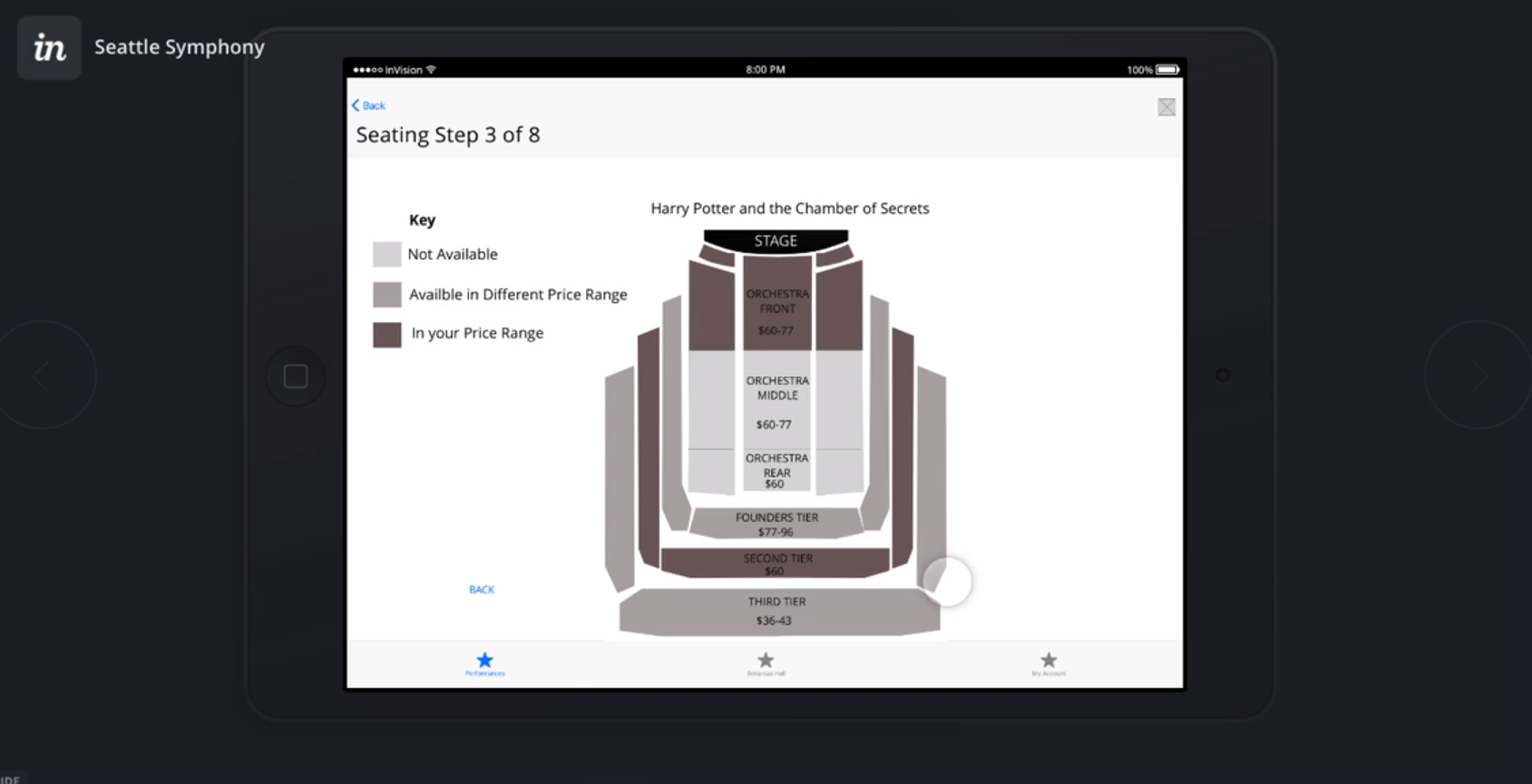
The solution was to design a digital prototype of a new Seattle Symphony app for tablets to take advantage of the improved legibility of a larger screen.
Digital Prototype
Featuring interaction design by Beatrice Roman.
The full Invision prototype can be explored here.
Discovery and Research
Methodology
I began by collecting attitudinal data about the Seattle Symphony and the experience of online ticket purchasing.
- Exploratory research included telephone and face to face interviews as well as collecting online reviews.
- Diagnostic research included usability testing and evaluation of the existing Listen Boldly mobile app.
- Generative research included synthesizing user pain points from multiple data streams and creating a proto user persona.
Ethnographic inquiry
I cataloged over 100 online reviews on Facebook and Yelp to identify what people loved about the Seattle Symphony experience and what caused them frustration. Overall the symphony was very positively reviewed, with most negative comments directed towards other guests rather than the venue or performance. However, there were some complaints from concertgoers who wished they had more information about set lists and play times that could potentially be addressed by the redesign.
Interviews
Participants were screened with a Qualtrics survey about their online ticket buying behaviors. All 5 participants purchased several online event tickets in the last few months.
The one aspect of online ticket buying most consistently linked to negative emotion was hidden fees, which all 5 users spontaneously and independently mentioned as a source of aggravation. The second most common complaint was frustration with convoluted seat selection processes. Difficulty finding parking and insufficient information about the content of a performance also came up in several interviews. The only positive emotion anyone associated with ticket buying was related to speed and convenience.
"By this point surprise fees are something I've come to expect."
"I click an email link, sign in to a site, I don't remember the password because who gives a shit, I just reset the password every time."
"The best ticket buying experience is when they have all my information already, I can just click it and go."
Usability Testing of existing app
I tested the existing Listen Boldly app with our key demographic of older tablet users who love the Seattle Symphony. I asked them to complete four routine tasks and took note of their interaction with the app, and followed up during debrief interviews about any part of the experience that appeared to invoke particularly strong emotional responses. Testing revealed critical usability flaws in key task flows and confirmed preliminary assumptions about legibility issues with the small font for older adults.
Because one of the testers had extremely high tech empathy and one extremely low tech empathy, I was able to get a sense of which problems were being caused by lack of familiarity with mobile tech and which problems transcended issues of technical fluency. Both testers reported that the small text size led to problems with legibility. Of the four tasks I chose, the only one both testers could complete was learning more about the history of Benaroya Hall, arguably the least important from either a business perspective or a user perspective.
problem Screens from the existing "listen boldly" app
Users are bombarded with permission requests immediately upon opening the app.
Tap targets on the bottom of this seating chart are too small for fingers.
During account creation, the address field gets stuck on "US Embassy."
Synthesis
Pain point mapping
I wrote out user pain points from multiple data sources on color-coded sticky notes and posted those notes onto a task analysis diagram to identify where in the ticket-buying process users of the Seattle Symphony were experiencing the most frustration. Tasks responsible for disproportionate frustration were assessed to see which could be feasibly addressed by redesigning the app. High pain/high feasibility tasks were given priority for redesign, with seat selection at the top of the list.
proto-persona
I consolidated the user data into a proto-persona named Rosey Williams. Rosey is a 65-year-old retired grandmother. She loves classical music and cultural enrichment. She needs glasses to read and prefers the large screen of a tablet over mobile because of the better visibility. Because she's worried about malware, she gets anxious when apps she downloads request a lot of permissions. Her top concerns are convenience, legibility, and ease of use.
Recommendations
Based on my research I made the following design recommendations:
- Don't keep fees hidden until the end of checkout. Be as transparent as possible about the fee structure early on. Users like Rosey don't want to be surprised.
- Foreground the parking reservation feature, as this addresses a common user pain point for downtown venues.
- Focus on tablets to improve legibility for users with poor eyesight.
- Redesign the seat selection feature to improve legibility and usability. Tap targets must be at least as big as fingertips.
- Store user information for one-click checkout.
- Don't bombard new users with permission requests unless the permissions are necessary to use the app's central features.
- Redesign information architecture from the ground up. Menu choices should let users know what kind of content is available.
Sketching and Ideation
whiteboard design studio
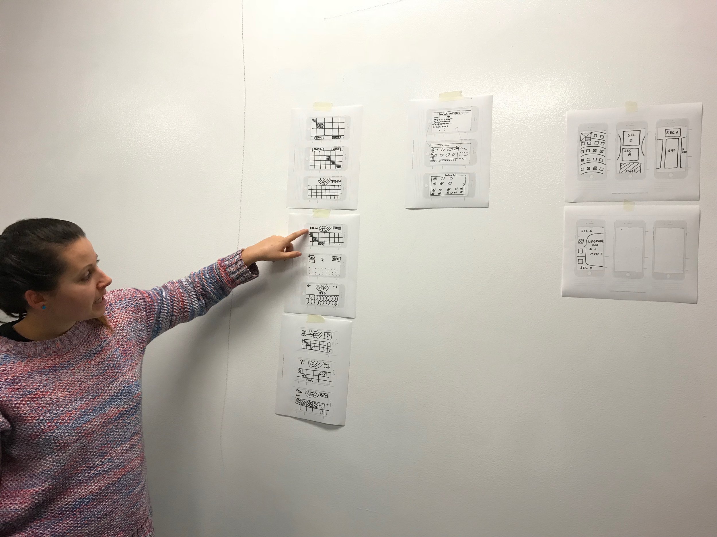
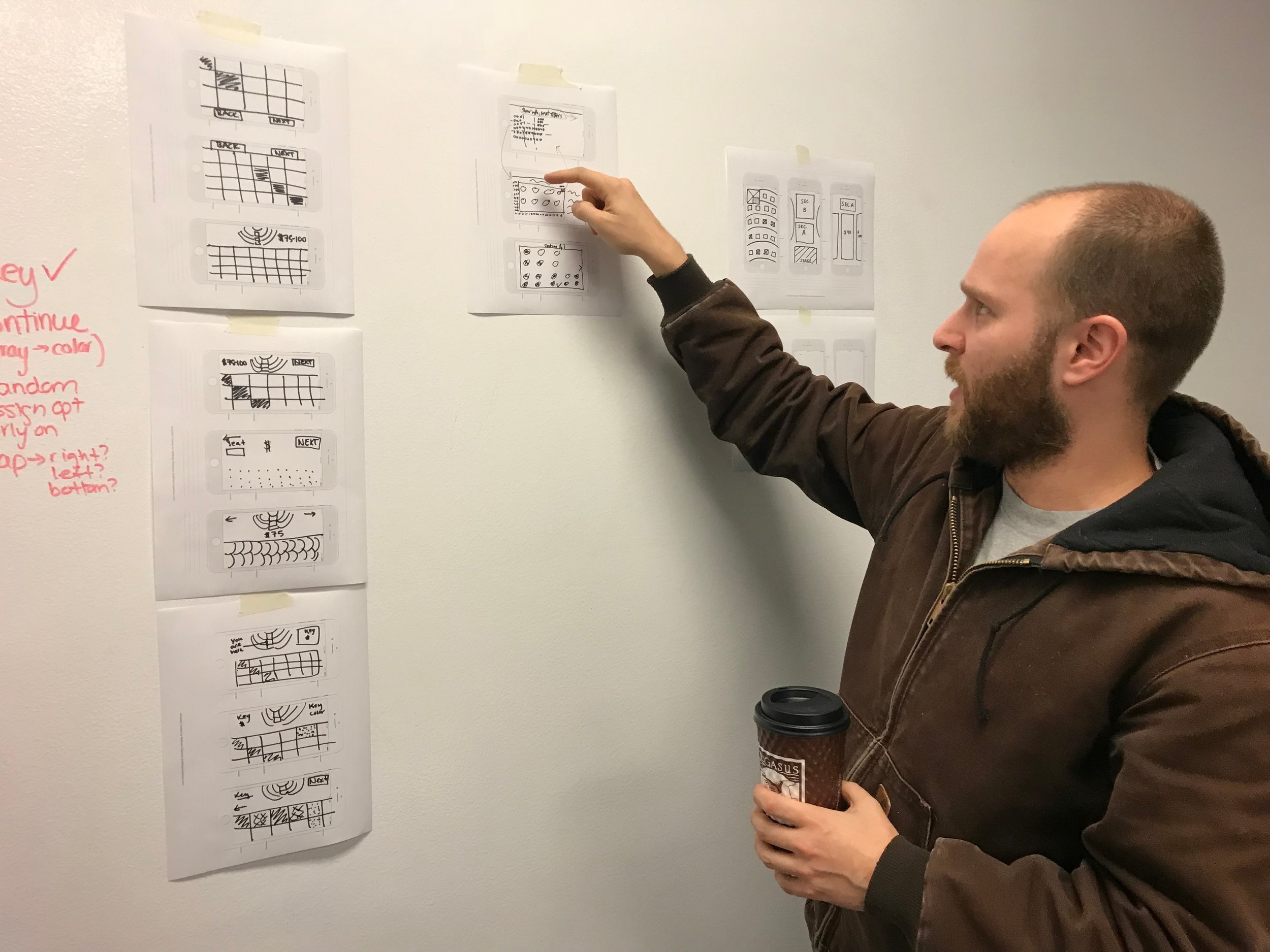
I participated in a whiteboard design studio with interaction designer Beatrice Roman to brainstorm ways to redesign the seat selection interface, which was particularly problematic on the existing version of the Listen Boldly app.
site map of Existing App
The information architecture of the existing Listen Boldly app was disorganized. Multiple menu buttons pointed to the exact same feature, and several peripheral features were foregrounded in main menus at the expense of more useful features.
The Symphony and Benaroya Hall menu buttons both go to the same list of upcoming shows.
The Upgrades menu only works if you use it during a live performance. Since behavior of other guests was one of the most common complaints in online reviews, it seems like a bad idea to encourage guests to use their mobile devices during a performance.
The Radio Station, which seems like it would be a very popular feature, is buried in an inconspicuous link on the Symphony's Instagram page. None of the test users ever found it.
The Encore Program, which is prominently displayed, was described by test users as "something I would throw away without reading if you gave me a paper version."
card sorting
I conducted card sorting with several volunteers to catalog different mental models that could be used to arrange site content and picked simplest model from card sorting to use as the basis for the redesign. Card sorters organized the content much more efficiently than the 7 top-level menu headings used in the existing app.
Redesigned Site Map
Following the principles of "remove, organize, hide, displace," I created a new architecture for the redesigned app. Redundant menu headings were consolidated into a single section. The "Benaroya Hall" heading was used to house information about the venue and the history of the Seattle Symphony, since that's what testing shows users like Rosey think that menu heading is referring to. Links to external content were organized under the Media header. Peripheral features like the Encore magazine were displaced behind more central features.
Prototyping and Testing
digital prototype usability testing
The prototype of the new design was tested with the same 4 tasks I used for usability testing of the existing app. The first version of the new prototype achieved a 100% task completion rate with all test users. However, it still had some misclicks, and some users reported being confused by the seat selection chart. Our second iteration prototype successfully eliminated all misclicks and was praised by test users for high ease of use.
Reflections
Teamwork overcomes adversity
Our project met an unexpected roadblock when the third member of our team, who had been responsible for project management and visual design, had to drop out due to a family emergency. Fortunately, my remaining teammate and I were able to step up and take on project management responsibilities. We decided to pivot to making a low-fi digital prototype in order to be able to complete the redesign without a visual designer. By keeping in constant communication and following the Agile method of daily scrums, we ended up with teamwork that was even more effective than it had been with both of us reporting to the former project manager.
Clear scope, Successful Problem Solving
The biggest priority for our redesign was the ticket buying process, since that was a core business need that was responsible for many of the pain points we identified in the existing app. In that version of the app, only 50% of testers could successfully buy tickets, and even the ones who managed to complete the task called the process "clunky." Testers using the new design called ticket purchasing "intuitive" and "pretty easy to use." Having a clear scope early on in the project made it easy to determine and deliver on top priorities.
Next Steps
Add features
With more time for the redesign, we would have attempted to build out some of the following features:
- Musician biographies in the History section
- Photos that display the view from whichever seat the user selects
- Identify which seats are wheelchair accessible
- Numbered seating chart


